


Fiction for Men: 20 Examples of Cover Art that Rocks
Iron Age Men's Adventure Authors Need Promising Illustration

This was one of the comments on my last post:
Why are all of these book covers so terrible? Is that on purpose, like a signalling thing, rahr I am manly barbarian see my cover rahr, or are men not hiring good artists? The old Conan and sci-fi books had awesome cover art. The merits of the books you are highlighting here are beside the point; I see a shitty cover, life is short, I assume a shitty read.
Is this guy in the habit of spewing hyperbole, or does he really believe all those covers are terrible? In an age when “likes” are more important than accuracy and clickbait is more important than content, folks often don’t consider the meaning of their own rhetoric, so it’s hard to tell.
Whatever the sincerity of that comment, there truly are a lot of lackluster (and just plain bad) book covers out in the men’s fiction indiesphere. Is this a generational phenomenon? For all the positive attributes (confidence, optimism, cooperation, etc.) of the average Millennial, perfectionism ain’t one of ‘em. I can hear them saying, “Meh. Close enough,” as they slap together their book covers in MS Paint. (To be honest, the first cover for my debut novel was not the best, either.)
My intent is not to scold, but to inspire. I’m gonna show you some glorious covers from yesteryear, when tradpub was the only game in town but men ran it, and high quality was the rule—not the exception.
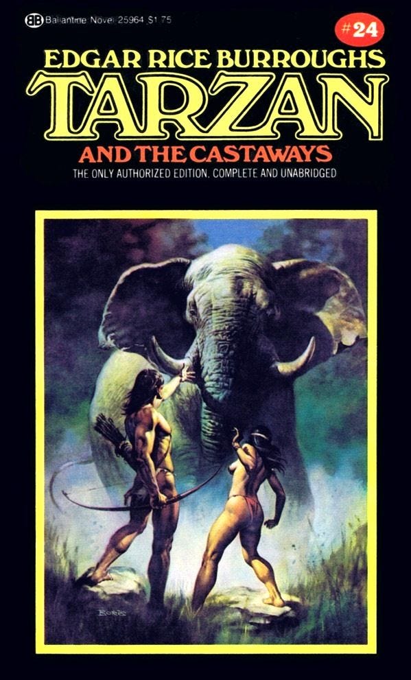
When the Tarzan stories were re-released for the umpteenth time (in about the 1970s, judging by the price) they were in this format, with fantastic paintings in the yellow rectangles gracing the front cover. Even if I didn’t like the pulp of Edgar Rice Burroughs, I would buy up this entire series if I could—just for the art.
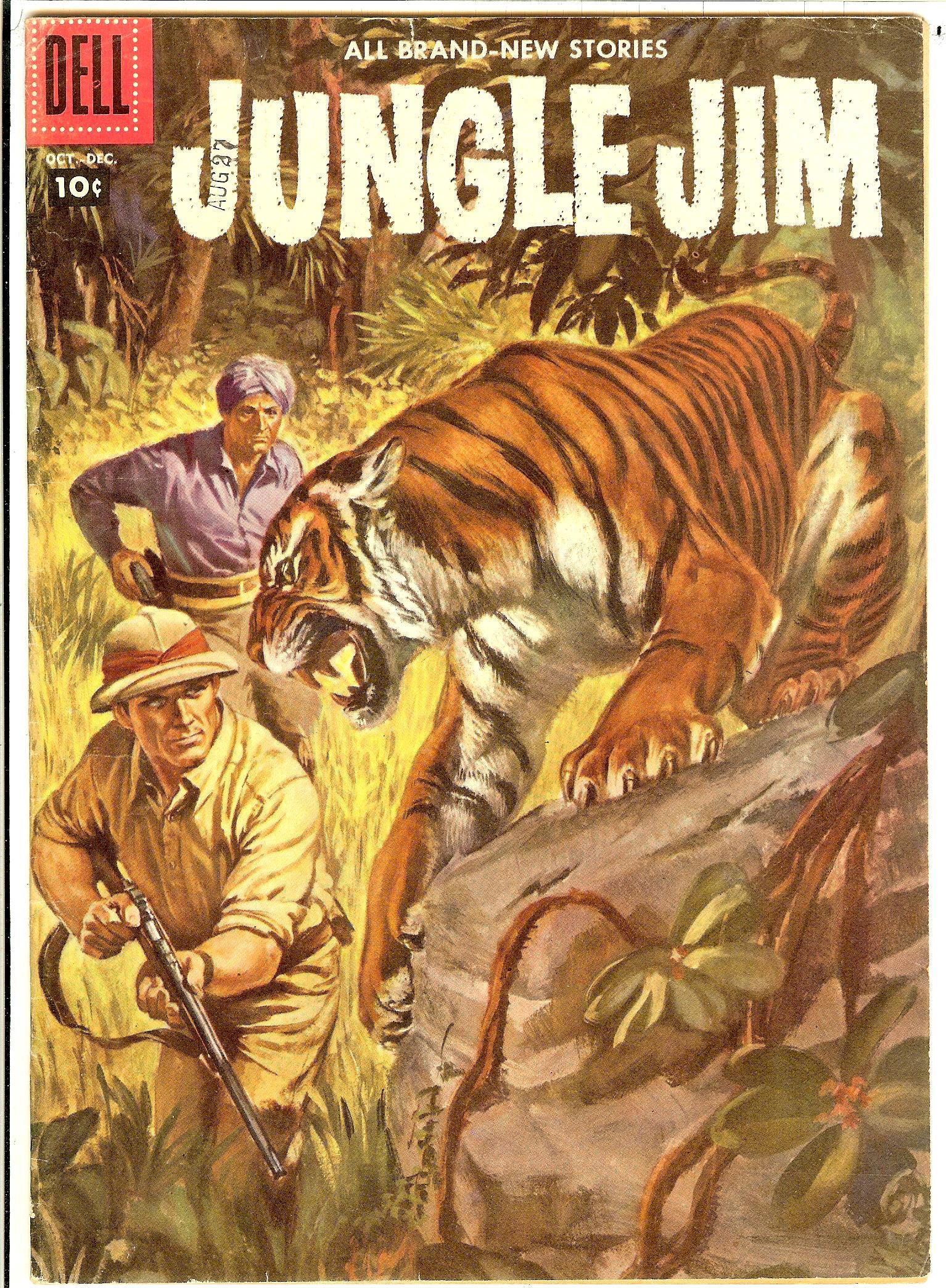
Jungle adventures were a staple of men’s fiction for decades. And with many more protagonists than just the legendary ape-man and his imitators. Remember that dome-shaped structure of intersecting pipes on the playgrounds during Generation X’s childhood? Where do you suppose it got its name?
It’s not truly men’s adventure without something dangerous for the hero to overcome. In exotic locales it could be the local flora and fauna…in addition to other men. Here, Jim and his sidekick have allowed a tiger to get way too far inside the effective range of the rifle, but Jim is not panicking. Somebody is about to die, here, and the art sells the danger of the situation very well. This scene probably doesn’t play a big part in the plot. Maybe the scenario doesn’t even occur. But it assures the reader there are thrills awaiting.
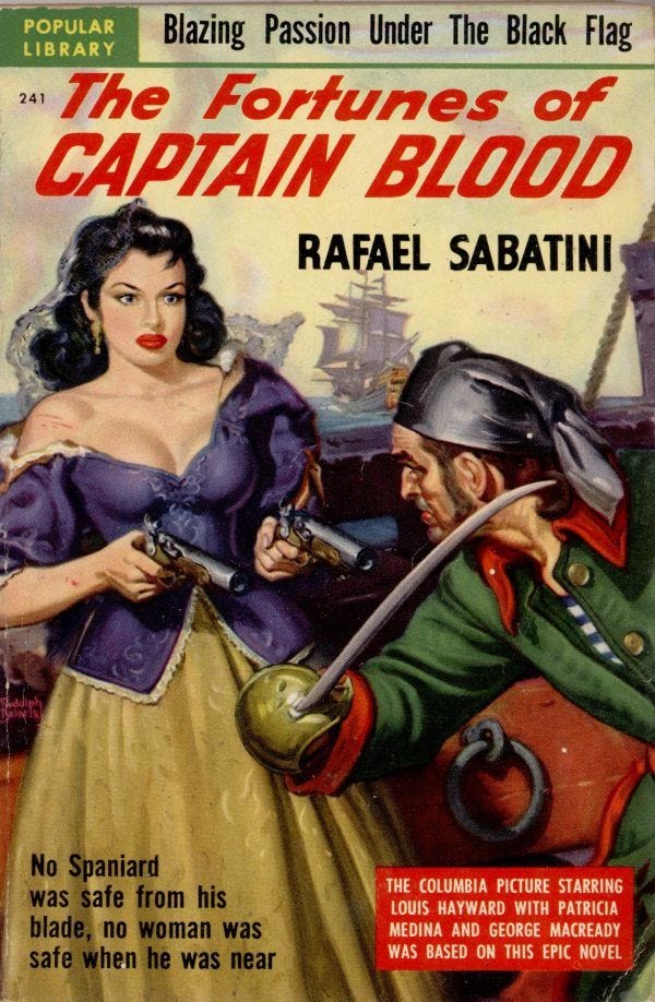
High seas adventure was once a popular genre—and it’s even got category representation on Amazon today. Swashbucklers like Captain Blood are one flavor. What could be happening in this scenario? My bet is on the woman being the erstwhile prisoner on the ship he’s boarding, but there’s a number of possible reasons she might be brandishing two pistols. Whatever the case, this image promises action and a probable romantic subplot with a feisty lass.
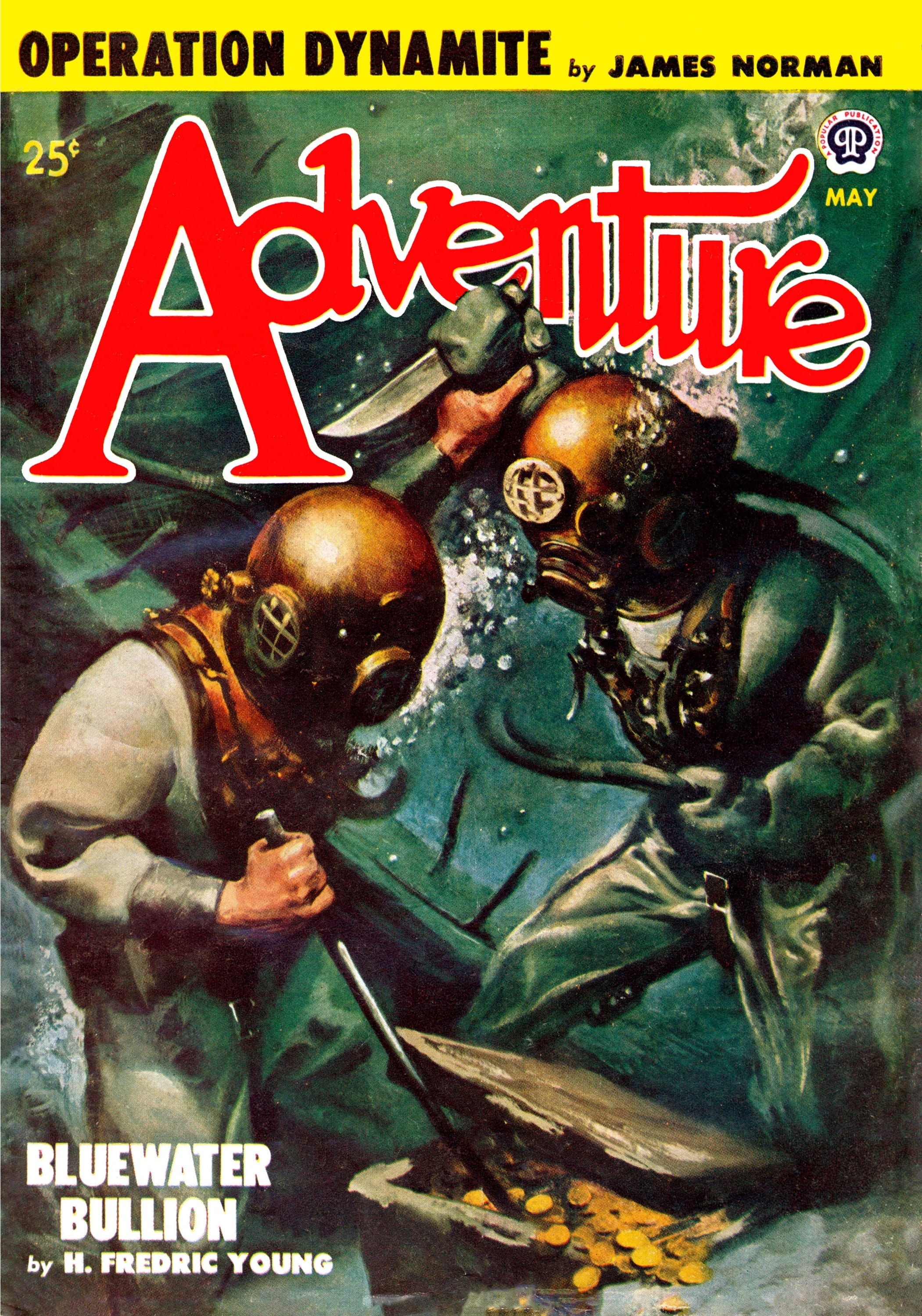
Below the high seas adventure is the undersea adventure—where piracy is still problematic. Rival deep sea divers duke it out over a chest of Spanish doubloons. Here is a story of a quest for lost treasure, with deadly obstacles to its recovery.
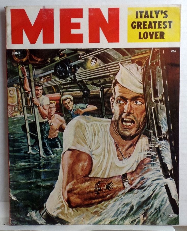
This is where high seas adventure transitions to war fiction. The painted image suggests either a shipwreck, or a near brush with death for the sailors on this craft.
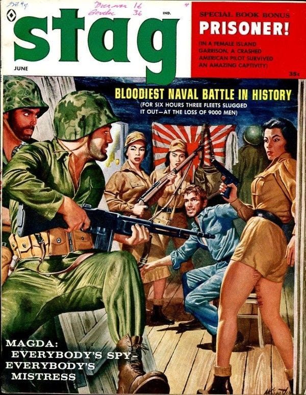
Speaking of (pulpy) war fiction, how is it that so many heroes often find available babes in theater? Because that provides another flavor of excitement, on top of the shoot-em-up. In this case it’s Japanese P.O.W. camp guards, showing plenty of skin. If I was captured and interrogated, I’d prefer it be by captors like this. But even better would be having some fellow G.I.s armed with B.A.R.s kicking the door in to rescue me before my bamboo manicure gets started. Just roll with it, and enjoy.
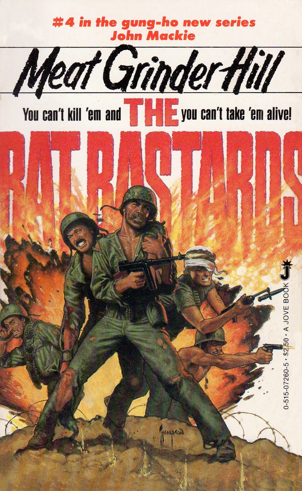
This one came from the 1980s. The quality of the art is still decent, but here, too, is a scene that didn’t actually take place in the book. What does this cover promise us? That an ensemble of battle-hardened G.I.s who prove hard to kill are gonna have to fight like hell. And that’s true of every Ratbastards book.
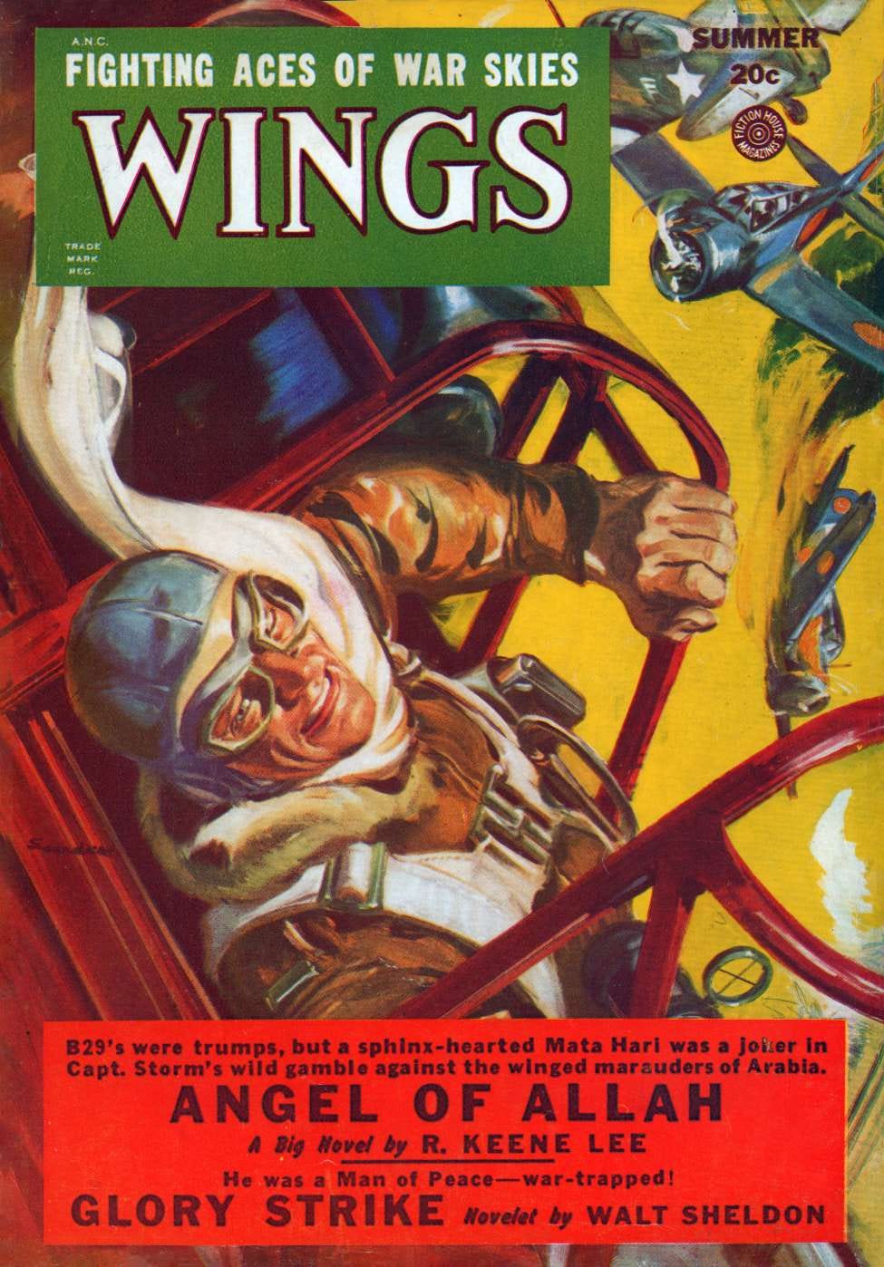
Now we transition from war to aviation adventure—a seemingly extinct men’s fiction genre. (And what a shame its extinction is!) Here a pilot is bailing out during a dogfight. Somebody should have told him that painting your fighter red makes it an irresistible target. Action; danger; setbacks. Would the discrepancy between the image and the text (in the red box) prevent me from buying this? Not for even half a second.
Aviation adventure may seem outdated, now that everything is pushbutton/computer controlled. But I still want to read about men flying by the seat of their pants, risking death to stop the bad guys. And that’s exactly what this cover promises. Looks like this might have been a book for boys—something else which should make a comeback (BTW, Raconteur Press and Ark Press seem to be planning exactly that!)
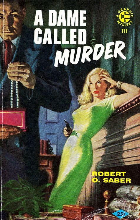
Detectives on the ground were often the hardboiled P.I. variety, and their stories often had covers like this. Any number of story developments could have led to the scenario on this cover. Nevertheless, what expectation does the reader have after seeing it? Crime and a dangerous temptress. So if you’ve written the literary equivalent of a film noir, this cover signals your audience that the book it adorns has the elements they’re hungry for.
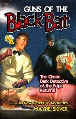
A spinoff of the crime/detective genre is vigilante justice. It goes back quite a ways and, in pulps, pre-dates the comic book heroes. This looks like a retro-pulp, but the artist nailed the style. Notice how all these classic covers suggest a story of their own to capture a reader’s imagination. Again, this exact scene may not occur in Guns of the Black Bat, but story elements are suggested to the reader: a dead body; a lady in danger; a murderous villain; a hero who is at home in the midst of danger, ready to deal out justice.
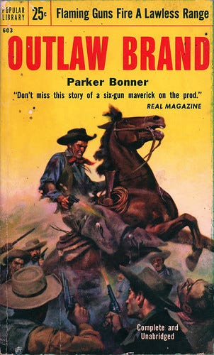
Very similar are many westerns about heroes who are not law men—but who have to shoot it out with bad guys anyway. Here the message is: “Read this for a thrilling tale of one man with the guts to face down the odds.”
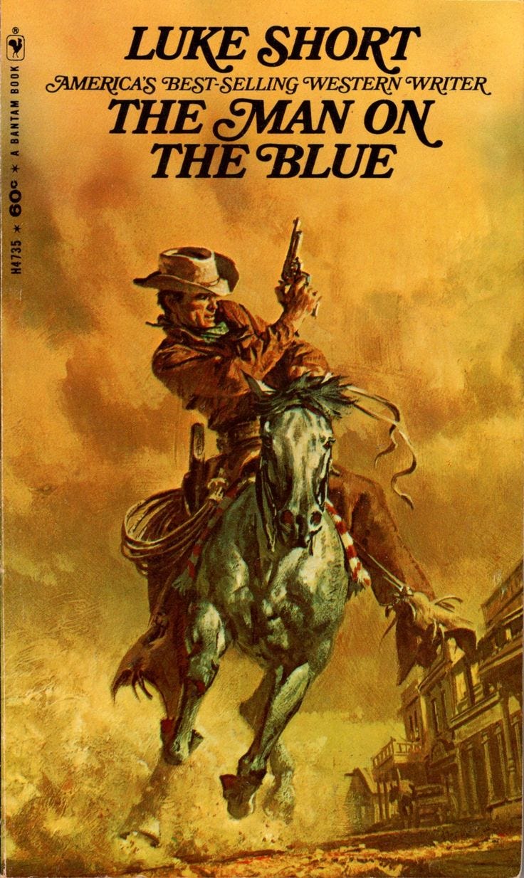
This western may be from the ‘60s or ‘70s. The art is a bit understated. You don’t see the source of danger, but you know something’s gone sideways because the hero is charging through the main drag of a town with his horse at a full gallop and pistol drawn. It’s an image with a more universal application, but it does promise action.
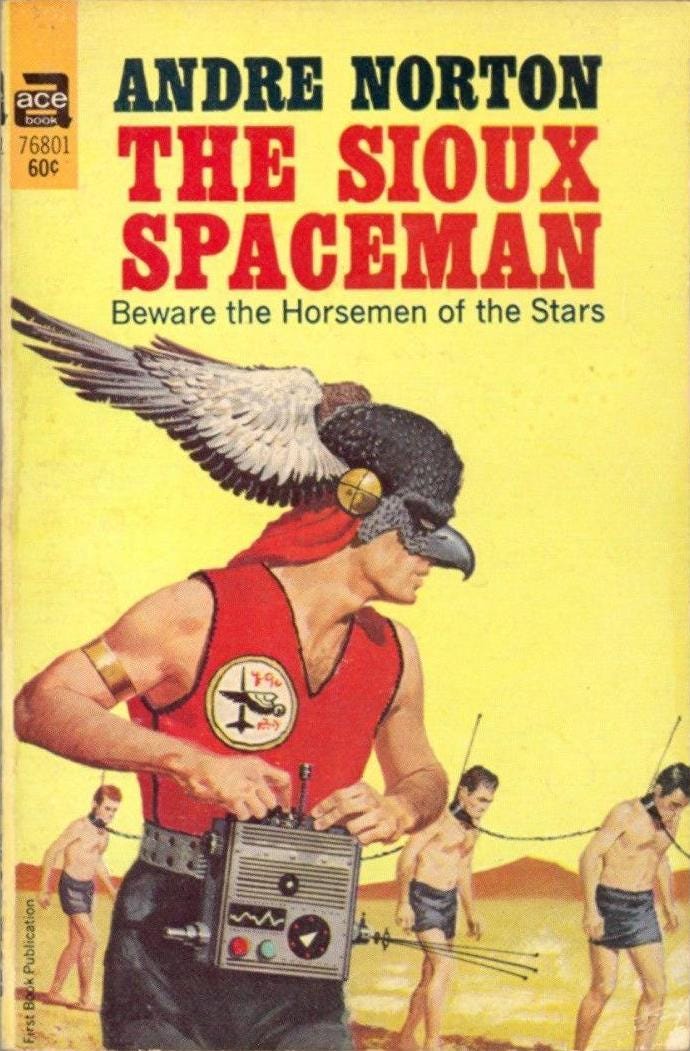
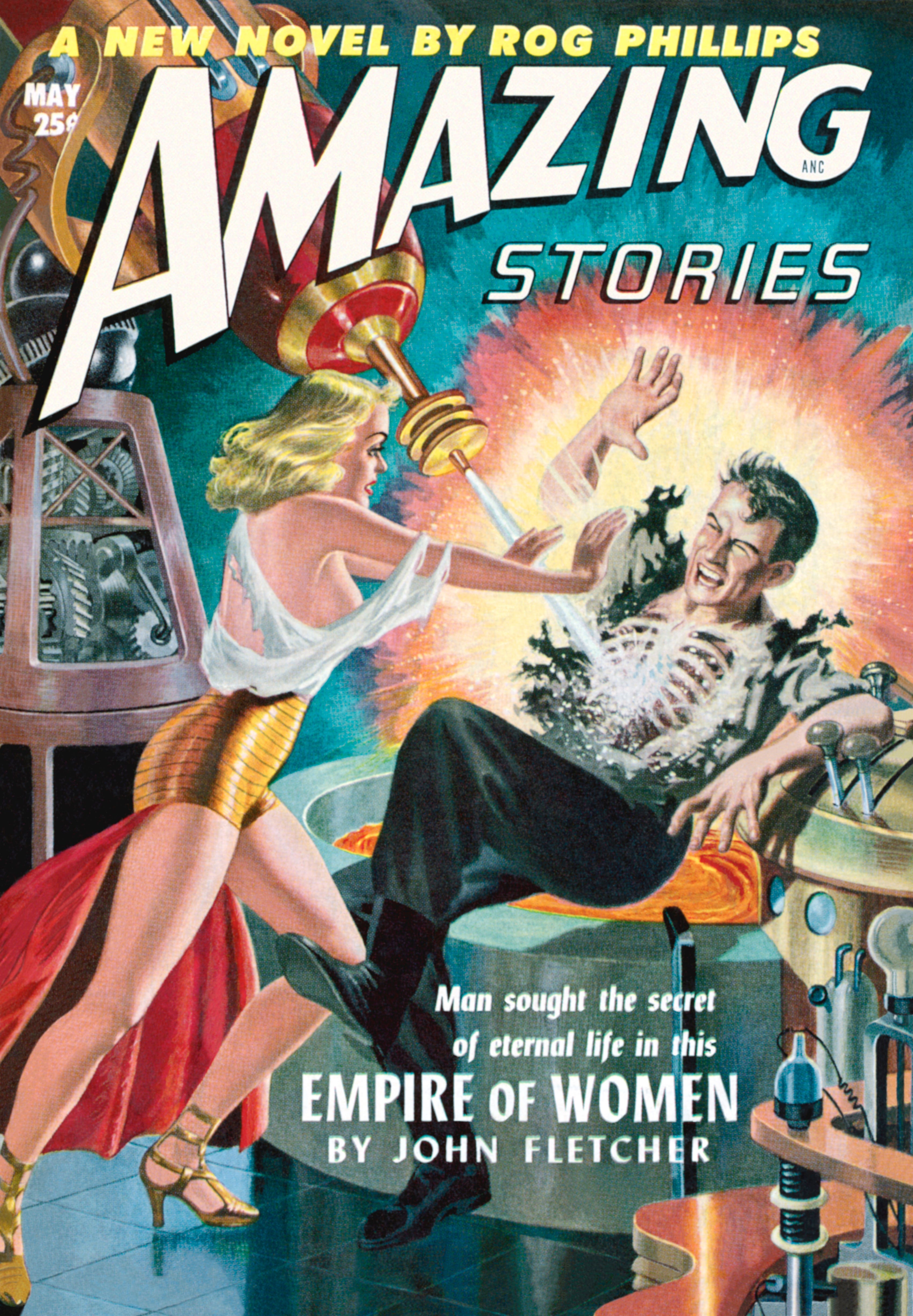
Classic sci-fi often had much in common with westerns. Here is some cover art depicting a more overt mash-up of genres. It might be on the campy side, but there’s a story being suggested here. Or many possible stories. We have slaves or prisoners being taken somewhere. Is the Sioux Spaceman their captor, or liberator? What is the purpose of that electronic device he’s carrying?
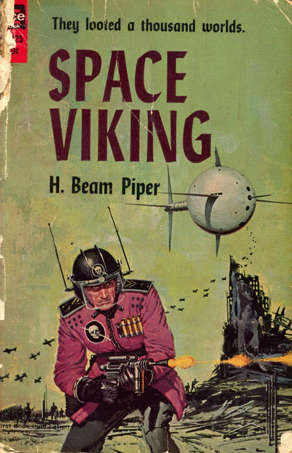
Another sci-fi/historical mash-up, at least in concept. I would guess this is from the ‘60s. This is another example of understatement and more universality. The visual promise is more about the type of main character. He plunders alien worlds like a space Viking. This is another one I would buy just for the cool speculative art.
This sci-fi cover is ripped straight out of the headlines. On the left is a sexy grrrlboss tradpub editor/agent. On the right is a white heterosexual male writer who had the audacity to query her regarding his manuscript which is not adequately feminist, gay, or communist.
This image is here simply because my fellow blogger and soon-to-be author
will like it. If you know, you know.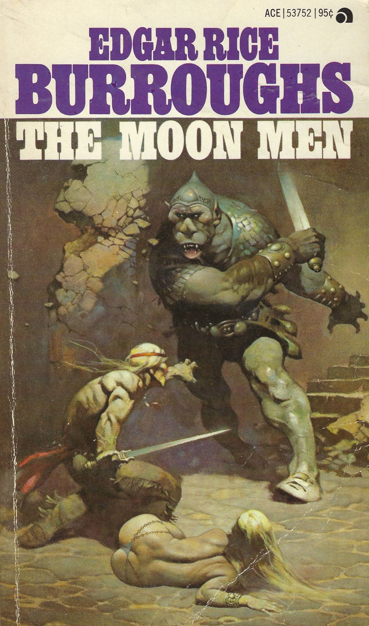
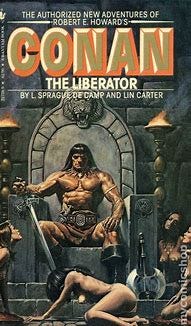
Perhaps not a coincidence that I saved fantasy covers for last, since so many Iron Age authors write fantasy. Classic elements: A. lady in danger; B. monstrous creature attacking; C. a seemingly outmatched hero, putting his life on the line to defend A from B. Yeah, I know—it doesn’t pander to “the modern audience” enough. Well, they can go watch Barbie, the remake of Snow White, and Brokeback Mountain. I am not in “the modern audience.” I couldn’t care less about “the modern audience” and my books are not for them. You should decide who your books are for, fellow authors.
Speaking of “the modern audience,” this cover would trigger them into apoplexy. In other words, I want one like it! But seriously, here’s the scenario: After civilizational collapse due to wussified gamma White Knights reading pozzed tradpub literature and putting entitled delusional womyn in charge of everything, one of the aforementioned grrrlboss editors begs a cancelled toxic man to restore indoor plumbing and social media for her. But probably not in that order.
Back to the understated and more universal. A simple idea personified—a fantasy warrior on horseback with a fantasy weapon, on a dark, hellish landscape. This screams “Grimdark!” though I don’t believe the term had been coined by the time this book was released.
With more talented artists living now than possibly any other time in history (not quite at the level of Frank Frazetta, but pretty doggone good), why is the average book cover today such a piss-poor artistic abortion compared to the badass covers of yesteryear? Why is men’s fiction—unshackled by the woketard checkboxes of traditional publishing—suffering from the same malady? (To some extent, at least.)
Men’s fiction authors, what should your book covers promise to potential readers? What expectations should your covers suggest? You’ve got imagination (or should have, anyway, if you’re writing fiction) and access to illustrators. Your covers need to start kicking ass. You should replace existing covers that don’t. Yes, I've been planning to replace the covers on a few of my shorter E-books. That should take place once I’m done with my current graphic novel project.
If you want to take readers along on a thrilling adventure, show them you mean business with a cover that promises such. But for the sake of all that’s holy, deliver on those promises.
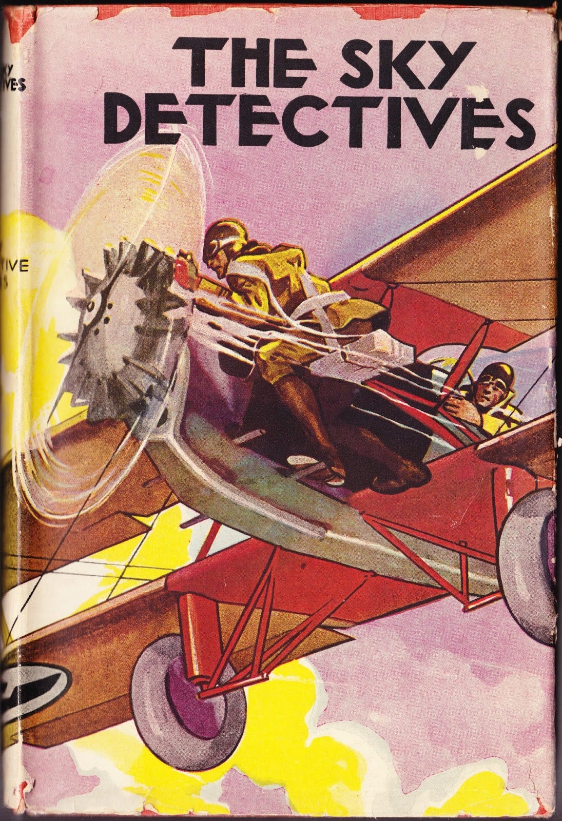
I think you misinterpreted the cover art for The Sky Detectives; that flyer ain't bailing out, he's repairing the engine in mid-flight.
You also need to look into the cover art for G-8 and His Battling Aces.
Good God! They have one cover where a monstrous man is not only daring to dogfight with G-8 and his Battling Aces, he's getting his air-to-air victory by RAMMING one of G-8's Battling Aces, and not only is he ramming his biplane into one of G-8's Battling Aces, he's simultaneously leaping from his cockpit to get at the G-8 pilot to throttle him.
I admire that level of dedication in achieving victory.
I think the G-8 series were aimed at a younger male audience than what you have here, but please do take a look. That's some great cover art.
Gorgeous covers! 😍😍😍